When I decided to ship Achieving Zen With Auto Layout, I knew I didn’t want to wait until the book was completely done before unveiling it to the public. The old way of publishing involved writing a book in a vacuum, throwing it through a bit of tech editing and then putting it on the shelves at Barnes and Noble.
I have a graveyard of books that are out of date or have a few technical inaccuracies, because they were printed to paper and unable to be updated without checking an Errata page on a publisher’s web site somewhere.
Tech publishers have started doing an “early access” program with their digitally published books as soon as a few chapters are available, which allows early readers to provide feedback to the author along the way of writing.
That seems like a much better way to write a tech book to me, so I shamelessly copied it.
Of course, I don’t have a publisher, so I’m doing all of this on my own. Here’s a few of the tools I’m using and how they all piece together for running.
Gumroad
I am using Gumroad to handle selling and distributing my book. There’s a few different vendors you can work with to do this sort of work, but I found the Gumroad interface to be incredibly easy to work with, and their analytics data is just enough to keep me interested, but not overwhelmed.
It also doesn’t hurt that their fees aren’t too high, especially coming from an Apple world where they want 30% of everything.
Gumroad collects the payments and then distributes a PDF of the current state of the book to people as soon as they purchase. They also support Webhooks, however, which I am taking advantage of. Each time a purchase is made, their WebHook fires an API I’ve set up on Azure.
Azure Mobile Services
Azure Mobile Services is the Backend-as-a-Service offering that Microsoft has for developers to easily integrate a server-side component into their iOS, Android, or Windows app. If you’ve ever messed with something like Parse or Stackmob, it’s similar vein to that complexity. You don’t need to provision servers or deal with a bunch of configuration. It handles most of the heavy lifting for you and provides an API for anything you want to get dirty with.
I’m using Azure Mobile Services to host a small API with a single endpoint. To do this, I have a small Javascript…script…that takes the receipt data I get from Gumroad, validates it, and then fetches the purchaser’s GitHub username.
Once I have the GitHub username, I make a call to their API to add that username to my private repository that contains the Markdown files of the manuscript as well as all the source code for any sample projects.
In all, it’s maybe 15 lines of code tops. It’s likely not the traditional use case for Azure Mobile Services, but it was way easier to do this than provision a complete WebAPI or Node application and deploy it to a cloud service or virtual machine.
GitHub
Now that I have a GitHub repository with all my beta purchasers on board, they are able to do a few different things:
They can see my progress as I write on the book. I try to only submit chapters that are completed first drafts.
They can file Issues with either requests for topics to cover, or any technical issues they may find in the book.
They can fix my typos (I admittedly never expected anyone to do this, but a few have taken the time. Thanks!)
The second one is the most useful to me. I’m now able to run this book like a semi-open source project and get instant, trackable feedback from the people who are invested in the project. There’s no middle man in between. It’s just me and the readers working together to make Achieving Zen With Auto Layout the best book it can be.
One of the least sexy features of iOS 8’s new developer SDK may in fact be its most important: size classes.
A History Lesson
When iOS was first introduced, we had one device: the iPhone. It had a 320×480 pixel screen and it came in any color you liked, as long as it was black. Even in this single iteration, it supported two orientations: portrait and landscape.
Designing an app that supports two orientations isn’t always as simple as letting views stretch and resize like Mobile Safari or Messages do. In a lot of cases, buttons and other controls need to be moved around to better take into account the altered sizing of landscape (480×320).
Fast forward several years later and we’ve got retina displays, iPads, and 5″ iPhones. Oh and all those devices also support multiple orientations of course.
The current/old way of solving this problem has been a mix of listening for orientation changes in your view controllers and custom views, as well as using multiple Xibs or Storyboards.
Let’s say I was building a universal version of Glassboard that supported the iPad. With iOS 7 and older, I would need to create a secondary Storyboard that had each of my view controllers re-established, its outlets redone, and its target/action sequences reconnected. Duplicate work. Any seasoned programmer knows this isn’t ideal. Having to make the same change in two different places sucks.
Now, let’s add in the areas where I wasn’t necessarily using a Storyboard or Xib. There are likely going to be checks in the code to detect orientation and device size so that I can adjust my constraints or frame-based layout code (like an animal) manually.
Your code is likely littered with a lot of this:
Size Classes
Obviously the above is not ideal, and it’s likely only going to get worse as Apple introduces new devices going forward.
WWDC is a wonderful opportunity to read tea leaves and see where Apple is going by their new APIs and how hard they are pounding concepts into your heads each year. In addition to pushing Auto Layout this year, you also saw many instances of a resizable iOS simulator and a new technology for handling all this crazy idiom and orientation stuff: size classes.
A size class is a new technology used by iOS to allow you to custom your app for a given device class, based on its orientation and screen size.
There are two goals with size classes:
To get developers and designers out of the habit of thinking in terms of specific devices, and instead thing of a more generalized approach.
To plan for the future.
The first one obviously leads to the second. You’ve no doubt seen the countless rumors that the iPhone 6, 7 or whatever is going to be a larger device. You’ve probably heard that Apple is working on wearables. Guess what will make developing for these new devices easier? Size classes.
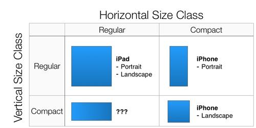
There are presently four size classes.
Horizontal Regular
Horizontal Compact
Vertical Regular
Vertical Compact
At any time your device is going to have a horizontal size class and a vertical size class. Together, those are what is used to define which set of layout attributes and traits to show the user on screen.
Traits
The horizontal and vertical size classes are considered traits. Together with the current interface idiom and the display scale they make up what is called a trait collection. This doesn’t just include where on screen specific controls should be placed.
Traits can also be used for things like image assets, assuming you are using Asset Catalogs (remember when I said to use the new stuff Apple introduces?). Instead of just having a 1x and 2x version of your asset, you can specify different image assets for a horizontal and vertically compact size class, as well as one for horizontally regular and vertically compact. In code, it still looks like the same UIImage call. The Asset Catalog takes care of rendering the appropriate image basd on the current trait collection.
Designing For Size Classes
Size classes are a nice addition for developers because it helps simplify the development experience when we want to support multiple devices and orientations. By making our job easier, Apple can more easily introduce new device sizes and sell developers on making their apps universal rather than just being an iPhone only product.
The biggest change for us developers is redoing our orientation code for the third or fourth time since iOS was created. We’re developers. We’re used to it.
For designers, trait collections means thinking less about the specific device you are designing for and instead thinking about the attributes of that device. The biggest attribute designers think in terms of now is physical screen size. Their mockups are pixel perfect for 320×480, 480×960 and the like.
Designing for those scenarios is no longer tenable as we move more towards a world where not every device is guaranteed to have the exact screen dimensions your Photoshop or Sketch mockups account for. Instead, the goal should be thinking about designing in the general sense for the class of device, which is presently:
Portrait Phone
Portrait Tablet
Landscape Phone
Landscape Tablet
If an iPhone 6 comes along and it has a bigger screen, my guess is that it’s going to have the same trait collections as the existing iPhone 4s and 5. Sure, the dimensions of the device will be bigger than the existing phones, but the UI should adaptively handle those changes based on your already defined interfaces for those specific trait collections.
This is likely the point where the designers have flipped over their bamboo work benches, but it’s the reality. Just like software development, software design is about adapting to the constraints. The new constraint is that we no longer have a world where we’re building towards a specific screen size. We’re not approaching Android levels of craziness, but this absolutely preps us for where Apple is headed.
Adopting Size Classes
The good news is that Interface Builder makes working with size classes easy. The better news is these Interface Builder changes are backwards compatible so you can simplify and consolidate Storyboards and Xibs where appropriate without leaving behind any legacy users.
The not so good news is that if you want to work with trait collections in code, it’s iOS 8 only. This shouldn’t come as a shock as Apple rarely backports new APIs to legacy versions of the OS. What it does mean is that you’re going to have to add some additional branching in your code to account for when you want to, for example, adjust the intrinsicContentSize of your custom UIView. If the device is on iOS 8, you can use the horizontal or vertical size class to help determine that value. If the device is still on iOS 7 or whatever, the existing code you’re using will have to remain deployed.
Since I use and recommend Interface Builder, my work load is significantly less than those that are still living by the “write everything in code” mantra. If you find yourself still in that camp, I’d highly recommend using iOS 8, Xcode 6, and trait collections as an opportunity to get on the Interface Builder bandwagon. It’s not only going to lessen the amount of boilerplate code you have to write, but it’s also going to simplify your code base by extracting out a lot of the trait handling into a visual UI.
The ski bum of the iOS development community Kirby Turner wrote up how he using Auto Layout and was lucky enough to get a large audience for it through iOS Dev Weekly. I’m happy to see that Kirby is embracing Auto Layout. I did take issue with the premise of his article though: that he is writing all of his constraints in code rather than using Interface Builder.
It’s totally possible to do this, and there are situations where I do it as well. Small views with a few basic constraints are usually quicker and easier to write without a Xib. Insanely complex views such as the [TED video player] I wrote and maintain are also too heavy for a straight Xib implementation.
For pretty much any situation outside of that? You are doing yourself a disservice avoiding Interface Builder now that we are switching to using Auto Layout rather than springs and struts.
Why? Allow me to share a few reasons.
Instant Ambiguity and Conflict Checking
When you are defining the constraint-based relationships between your views in Interface Builder, you get real-time feedback in the Xib or Storyboard’s sidebar. If you see a yellow circle, there’s likely a misalignment. It’s a warning. If you see a red circle, there’s either a conflict, ambiguity, or some other issue that is going to cause pain when you build and run.
If you write all your constraints in code, you don’t find out about these sorts of issues until you run the application and get hit with an exception.
Code Is A Liability
The less code I have to manage, the better. Not only do Xibs and Storyboards let me visually lay out the main components of my interface, I can also define the attributes on them without having to type out more code. That’s something we have always had.
Now with Auto Layout, we can also define our constraints in the same Xib files rather than having to sprinkle bits of code all over our projects. Every line of code you write now is a line of code you have to manage six months from now. I’d rather have less management personally.
You Suck At Typing
One of Auto Layout’s best features is its ASCII syntax for defining multiple constraints quickly. There are legimitate times where you don’t want to or need to lay out your constraints in a Xib. It’s not without fault though.
Let’s say you want to lay out a constraint with NSLayoutConstraint‘s constraintsWithVisualFormat:options:metrics:views method. Everything you type into the constraintsWithVisualFormat section has zero checking of its syntax. It’s just yet another string literal to Xcode. The only way you will know that you screwed it up is to run the app and see what crashed.
Apple could theoretically fix this in the future, but as of Xcode 5.1 you have to be a perfect typist. I’m far from perfect.
Visual Layout
From a learning perspective, I truly believe the best way to begin to understand and use Auto Layout is through Interface Builder. I’m a visual learner, and being able to lay out my views and then see a visual representation of the constraint relationships between two views is killer for fully understanding what the new layout system is doing.
By writing everything in code, you are putting yourself behind the eight ball before you have even gotten started. I’d put money on the fact that most people that try Auto Layout and then ditch it either haven’t touched Interface Builder since Xcode 4 (which sucked) or are trying to do all their Auto Layout work in code.
Summary
Interface Builder’s Auto Layout support isn’t perfect. There’s plenty of things I’d love to see Apple change, but writing all your constraints in code only should be the exception, not the norm.
If you’re still struggling with Auto Layout, be sure to check out my Auto Layout Resource page.
One of the Twitter searches I check every few days is for “Auto Layout”. Twitter is a wonderful place to find people complaining about technologies, and pretty much the only information you’ll see on the Auto Layout search for Twitter is complaints and confusion.
Recently, I read an article from Brent Simmons on his struggles with adopting Auto Layout in Vesper. He claims its kryptonite in a lot of ways and causes more struggle than it’s worth sometimes. Brent is a smart guy, so seeing him fighting the technology isn’t a good sign for others who are just coming to iOS or OS X having much better luck.
Maybe I can help a bit.
Why Auto Layout Exists
Springs and struts has existed nearly as long as I have been alive, so why did Apple even bother doing something like Auto Layout? Springs, struts, and auto resizing masks weren’t necessarily broken, so no need to fix it, right?
Ultimately, Apple believed they were building something better in Auto Layout. Auto Layout offers a lot more functionality and power when building complex layouts in exchange for changing how you think about building your interfaces.
Rather than placing your views on the screen, Auto Layout is about describing the relationships between each of the views and how they relate to either its superview or adjacent views. On the surface, it’s far easier to say that you want to center a button vertically and horizontally in its parent view with an NSLayoutConstraint call than it is to do the math to calculate the exact CGPoint you want to place the button on screen.
From a fussy developer perspective, Auto Layout also helps alleviate some of the Massive View Controller problems that have plagued developers over recent years. Things such as the intrinsic content size and alignment rects allow us to do a lot of view sizing calculations in the view subclass where it belongs rather than in your controllers.
Finally, Auto Layout also enhances the usefulness of Interface Builder, a tool that has been around for decades and is one of the major selling points Apple has when showcasing their developer platform. It got off to a rocky start with Xcode 4’s frustrating Auto Layout implementation, but Xcode 5 has been great.
Debugging Constraints
While the learning curve of Auto Layout isn’t as bad as it once was thanks to the vastly improved support in Xcode 5 and 5.1, there’s still plenty of issues you run into when you are coding up and debugging your constraints-based layouts.
In Interface Builder, debugging constraints is nicely done. If you’ve got misalignment, conflicting constraints, ambiguous layout, or a variety of other issues that could plague your UI, Xcode will instantly warn you and offer ways to resolve the issue. I believe this has helped people immensely understand Auto Layout better.
If you need to work outside of Interface Builder, Apple’s debugging advice for constraints is fairly caveman. There are a few lldb commands such as _autolayoutTrace and exerciseAmbiguityInLayout that can help you figure out how to resolve your issue.
One thing that I don’t think too many people know is that there is an Auto Layout instrument in the Instruments app that you can use to observe what is happening to your layouts in real-time. There are a few caveats to using it on iOS, however.
It only works in the Simulator.
You’ll need to manually add it to a blank Instruments document from the tools library.
Finally, one of my favorite tricks is to set a restorationIdentifier for every view in an iOS view and then using that to help visualize and understand constraints when printing them out in lldb. Here’s a debugging category I use to accomplish this.
With this in your project and your restoration identifiers set, the values output by po self.view.constraints becomes a lot easier to read and understand as well.
It’s Apple’s Turn Again
I was hoping that almost a year after I started pushing the gospel of Auto Layout that we’d be past the point where people are still fighting the technology, but sadly we’ve reached the point where I believe it is on Apple to improve the tools and documentation for Auto Layout if they want to continue to see its adoption grow.
My biggest request? NSWindow on the Mac has a visualizeConstraints method that makes it easy to see what each of your constraints is doing in a running app. Having something like that that applies to any UIView would be immensely useful.
On top of that, the ASCII language, while powerful, offers no real-time syntax checking which leads to a lot of cavemen build/run/check scenarios when you forget a bracket or mislabel something.
And finally? A less verbose syntax. I’ve watched more than a few eyes glaze over when I try to verbally read out “constraint with item attribute related by to item attribute multiplier constant”. There’s opportunities to shrink and simplify that syntax for a variety of common scenarios such as vertically or horizontally centering a view with another view. In fact, if you search GitHub you’ll likely find a dozen different short-hand projects that do just that.
WWDC is just around the corner. Auto Layout isn’t the sexiest technology Apple can highlight during its keynote, but it’s one of their most important going forward. It’s true you don’t need Auto Layout to deal with different screen sizes and orientations, but I sure don’t want to go back to doing it the old way. As Apple starts dealing with different screens in the future, making sure that Auto Layout is at the forefront as an accessible and understandable foundation for layout is essential.
All of the projects I am currently working on are targeting iOS 6, so I have used it as an opportunity to finally dive into the deep end with Auto Layout. Committed was my first foray with the technology on the Mac this summer when I laid out the preferences window using constraints rather than traditional springs and struts.
On a simple window like that with just a few tables views and buttons the experience is pretty straight forward. As I don’t have much experience with anything more complex on the Mac, I’ll refrain from commenting on that experience much more.
My focus the past few months has been on iOS where Apple introduced Auto Layout as part of the iOS 6 launch. Auto Layout is touted as being superior to the old springs and struts based layout styles because it allows building layouts that can scale to a variety of different screen sizes. Working on a platform with 3.5″, 4″, 7.9″ and 9.7″ devices? Sounds like a great technology to adopt!
The Learning Curve
Auto Layout has one of the steepest learning curves of any new technology I’ve worked with. There are at least three different things you need to keep track of on the basic level. Step one is wrapping your head around working with constraints in Interface Builder. Step two involves using the code-based NSLayoutConstraint, which includes the visual formatting language. Step three revolves around debugging and dealing with more advanced things like animation.
Even after a few months of using Auto Layout, I still don’t feel the level off comfort using the technology as I would with any previous ramp up I have had.
Interface Builder Is The New HAL 9000
Apple tends to recommend laying out constraints using Interface Builder whenever possible because it’s a bit easier to visualize what you are doing. Plus, who doesn’t prefer clicking buttons instead of typing more code?
What frustrates me about setting constraints with Interface Builder is its instance on adding more constraints automatically for me, even if I don’t want/need them. I’d love some sort of button or setting I can click to tell Interface Builder to back off and just let me handle everything.
The workaround I tend to have for these constraints I don’t really want or need is to set them with a lower priority (Radar: 12625299).
Debugging Ambiguous
I’ve had better luck trying to read women in my failed relationships than trying to debug why my constraints aren’t working out. When working with a view in Interface Builder, I’d hope that it would be able to tell me that my layout was ambiguous before I went through the process of recompiling and running my application.
In the case of the primary project I’m working on right now, all the constraints are written in code, so the only recourse for debugging really is calling [self.view _autolayoutTrace]1 from LLDB. Calling _autolayoutTrace will give a breakdown of the hierarchy of your views and list any of them that have ambiguous constraints, but that’s it.
Great. I have view that’s ambiguous. Now what? A lot of trial, error, and tears usually. There’s a category on UIView called UIConstraintBasedLayoutDebugging that has three methods for trying to debug constraints, but it’s still far more trial and error debugging than was ever necessary with springs and struts.
OS X has an Instrument tool for working with constraints, but it’s not available for iOS. I’ve never used it, so I can’t speak to its benefits but in general any tool that makes debugging easier would be a win. (Radar: 12625327)
Ideally there would be a way to visualize constraints either on device or in the iOS simulator so see what constraints are affecting a specific view. NSWindow has something similar to its visualizeConstraints: call. I’d love to see that for iOS. (Radar: 12625312)
Documentation?
When something has such a steep learning curve as Auto Layout, you want to provide as much documentation and help as possible, especially if you want developers to adopt the technology.
In the case of Auto Layout, the best documentation isn’t in Apple’s official documentation. It isn’t in a book. It’s in three hours of WWDC 2012 videos. Seriously, if you are going to work with Auto Layout you should watch sessions 202, 228 and 232. And then watch them again.
The problem is that a lot of the information I find in these three hours of videos isn’t really replicated in the documentation. Like a lot of Apple documentation, it highlights the happy path of what you can do with Auto Layout, but leaves you to sink or swim once you get beyond that. The WWDC videos, on the other hand, handle a lot of those hairy edge cases and complexities you may run into when working on a product that is larger than demo size. Sample code on Apple’s side related to Auto Layout is also pretty sparse. Again, I’m a visual learner. (Radar: 12625370)
Animation
Animation is a core component of a modern OS X or iOS application. At a basic level, animation revolves around adjusting the frame of a view or adjusting its transform. With Auto Layout, the recommended way to do any sort of animation is to animate the constraints.
Animating constraints is a bigger pain in the ass than animating frames. You have to keep a strong reference to each constraint that you want to animate and usually either re-set the constraint or adjust its constant value depending on what you’re doing. I recently was trying to figure out how to zoom an Auto Layout-based view to fill the entire parent view that contains it. I uploaded a sample project to iOS with a solution to the problem, but I can’t help but feel like I had to write way more code to accomplish this than I ever would have the old way
I don’t really have a suggestion for a way to improve this. I just think it’s a pain point.
Despite the learning curve and the frustrations I have with Auto Layout in its current incarnation, I plan to continue to use it. Unlike something like bindings on OS X, I think they are a fundamental aspect of development going forward that will be difficult to avoid using.